Sponsored
PerformanceSound
Well-Known Member
Lol...yup. Looks more “cartoonish” than “business.” I like the MKIV’s defined logo more.I hope that's not the official logo. It looks like simplified A80 logo, not a refreshed one.
A70TTR
Well-Known Member
- Joined
- Sep 9, 2017
- Threads
- 8
- Messages
- 2,729
- Reaction score
- 10,077
- Location
- Japan/EU/USA
- Car(s)
- ST205 GT4, JZA70, JZA70 TT-R, S210 Athlete
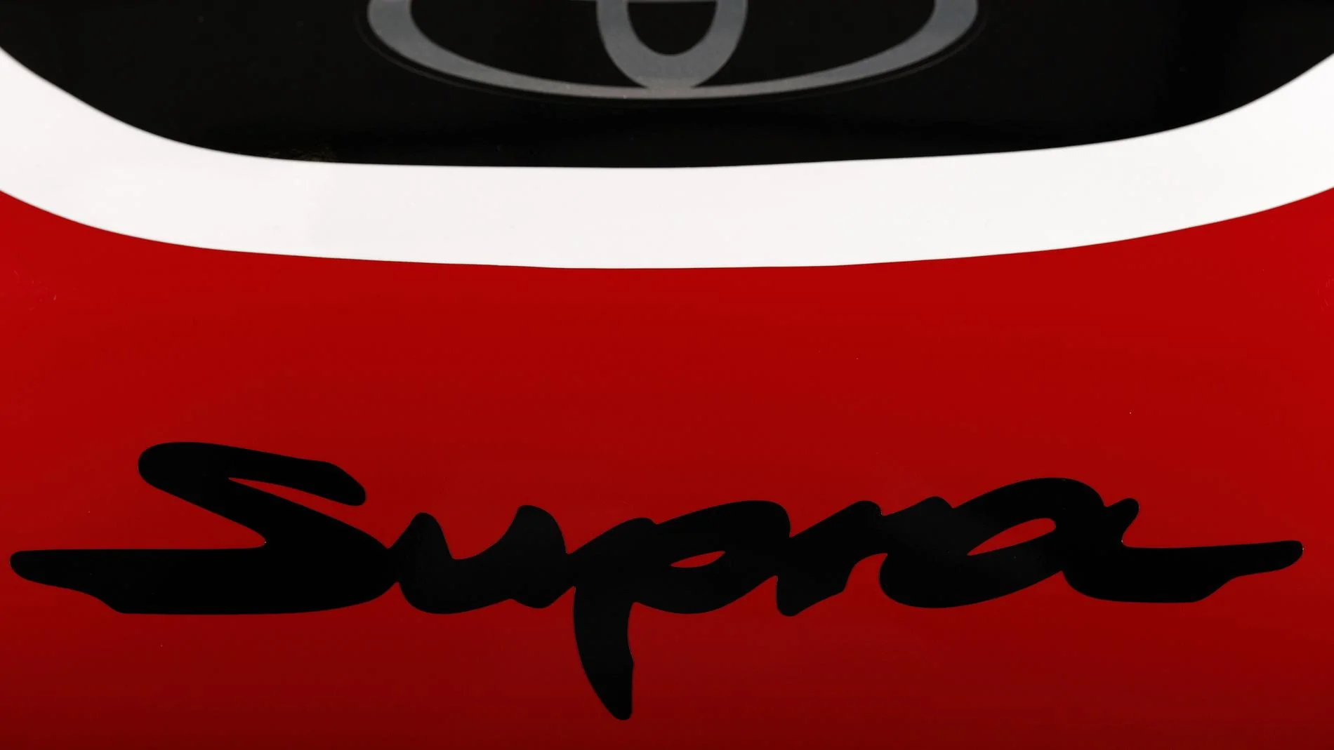
That is indeed the official script
It looks like simplified A80 logo, not a refreshed one.
I hope it's not the final design. Looks crap.
Lol...yup. Looks more “cartoonish” than “business.” I like the MKIV’s defined logo more.
PerformanceSound
Well-Known Member
What was so difficult or expensive for Toyota to reuse a great logo from the MKIV?....or come up with a whole new design? This “new” logo looks like an eBay knock-off of the MKIV’s logo....so badThat is indeed the official script
 .
.A70TTR, you knew this way back when I was asking and didn’t say anything...


Captain_Kirk
Well-Known Member
MKIV owners may have riot if Toyota used their beloved logo on a reskin Z4.What was so difficult or expensive for Toyota to reuse a great logo from the MKIV?


- First Name
- Mike
- Joined
- Feb 6, 2018
- Threads
- 2
- Messages
- 260
- Reaction score
- 684
- Location
- Californiaaa
- Car(s)
- 91' Nsx
- Banned
- #12
I like it.
ppl, will always find stuff to complain but in the end, this is just a "logo"
It does it's job, reminds me of the old one without being too new and modernized.
I will enjoy the ppl squinting trying to read what the hell that was that just blew by them.
ppl, will always find stuff to complain but in the end, this is just a "logo"
It does it's job, reminds me of the old one without being too new and modernized.
I will enjoy the ppl squinting trying to read what the hell that was that just blew by them.
surfmurf
Member
- First Name
- Murf
- Joined
- Jul 15, 2017
- Threads
- 0
- Messages
- 6
- Reaction score
- 2
- Location
- Pinellas, FL
- Car(s)
- 90 C-10, 81 S-10, 63 T-Bird, 55 3100
That is one homely looking vehicle. Are those glue on parts just to test the look or is it real (aka, a mistake)? Looks like the donald had something to do with this design.Looks good to me. I think it was smart to tone down the dated "graffiti" look.
At least the tires & wheels are still round!!
PerformanceSound
Well-Known Member
True that.MKIV owners may have riot if Toyota used their beloved logo on a reskin Z4.

2JZ-No-Sh*t
Well-Known Member
I don't love it, but I think it looks ok. Besides, I'm betting half of you guys are going to debadge your cars anyways.
Sponsored
Similar threads

- Replies
- 52
- Views
- 12,022
