Axix23
Well-Known Member
debading all the emblems for the clean looks reminds me of the 90’s when all the imports started into the mini truckin’ style of shaved door handles and etc.Why would we do that?
Sponsored
debading all the emblems for the clean looks reminds me of the 90’s when all the imports started into the mini truckin’ style of shaved door handles and etc.Why would we do that?
Found the pic. This is what I'm going for. I really like the look. My car is also yellow.Thanks for this! Now that I see them together, I can see some difference. However, they look quite similar to me and since you won't be able to see the back and sides of the car at the same time. IT will be next to impossible to tell once they are on the car. I'll see if I can find the picture I saw that gave me this idea.
Ah I see, I was never super into that but I see the trenddebading all the emblems for the clean looks reminds me of the 90’s when all the imports started into the mini truckin’ style of shaved door handles and etc.
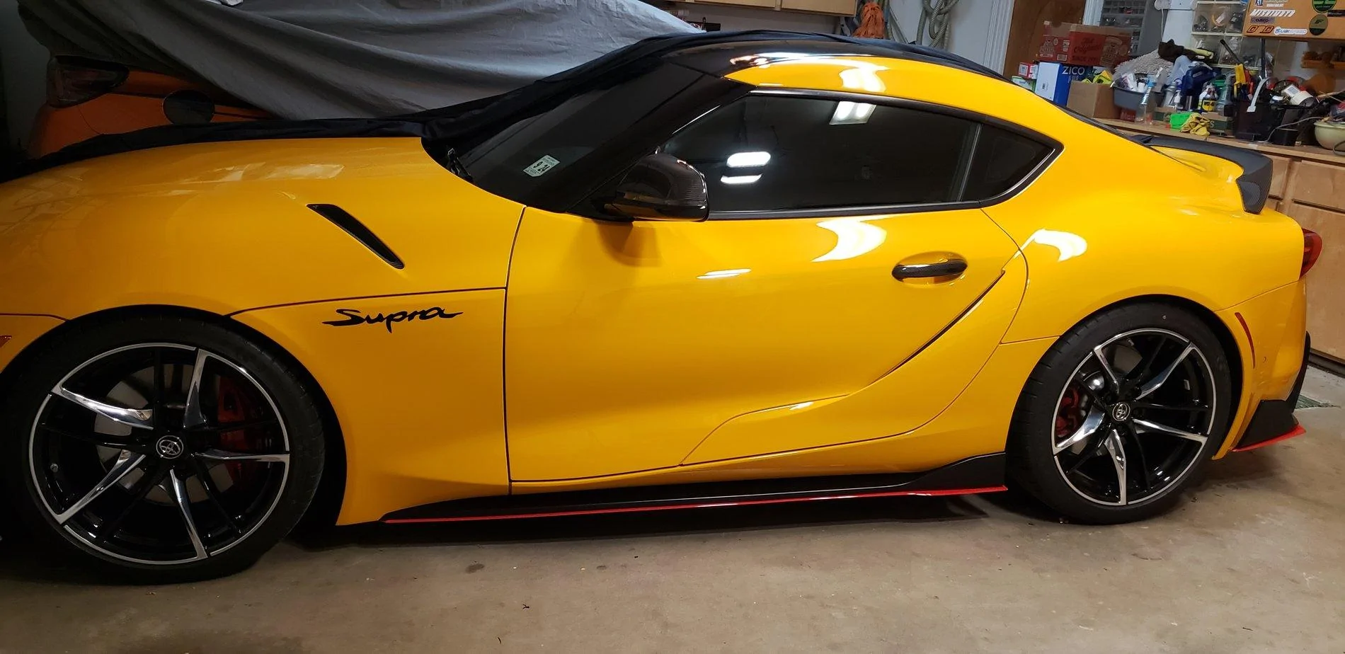
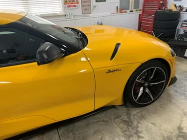
the Supra logo on the fender looks super tacky. So does that red trim on the bottom. Reminds me when I painted my accents on my car yellow on a white car. The 90’s trends are coming back!! LolFound the pic. This is what I'm going for. I really like the look. My car is also yellow.
Agree about the red trim but I really like the supra logos. Maybe it's nostalgia from my previous Mustangs and the 5.0 badges...the Supra logo on the fender looks super tacky. So does that red trim on the bottom. Reminds me when I painted my accents on my car yellow on a white car. The 90’s trends are coming back!! Lol

A fender callout that would be retro cool: a nice 3.0 emblem. Because it would be nice to be obviously not a 2 litre.Agree about the red trim but I really like the supra logos. Maybe it's nostalgia from my previous Mustangs and the 5.0 badges...

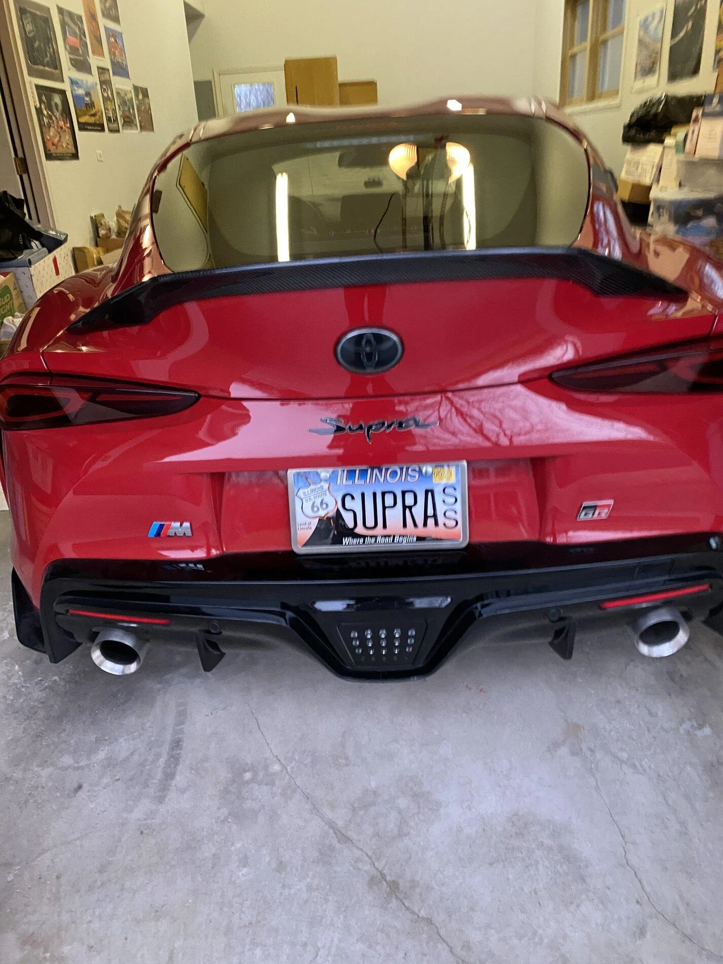
Personally, I'd be embarrassed to have the Mk IV logo on the side of my Mk V unless I'd also replaced the rear logo. The logos look significantly different to me. Maybe replace the rear logo, too?Now that I see them together, I can see some difference. However, they look quite similar to me and since you won't be able to see the back and sides of the car at the same time.
I actually like the red trim but not a fan of the logo lolthe Supra logo on the fender looks super tacky. So does that red trim on the bottom. Reminds me when I painted my accents on my car yellow on a white car. The 90’s trends are coming back!! Lol
Agreed that’s why i changed minePersonally, I'd be embarrassed to have the Mk IV logo on the side of my Mk V unless I'd also replaced the rear logo. The logos look significantly different to me. Maybe replace the rear logo, too?
I actually kinda prefer the Mk IV logo. It looks like something a skilled Japanese craftsman could produce on their own. The Mk V logo is somewhat soulless in comparison, and it's something that would obviously not have been possible without computer assistance. I don't feel too bad about that, though, because it's also true of the car, and the car is great.
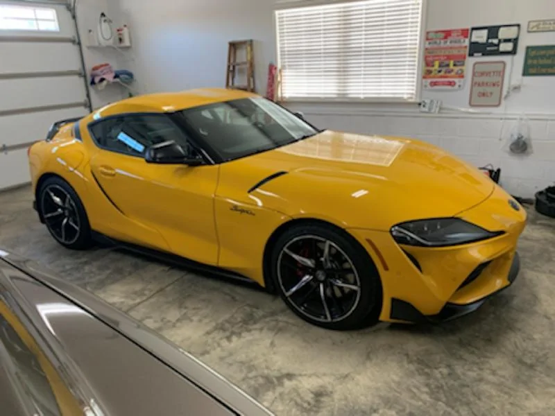
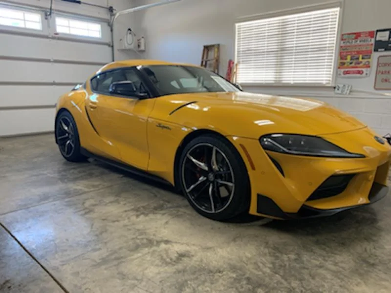


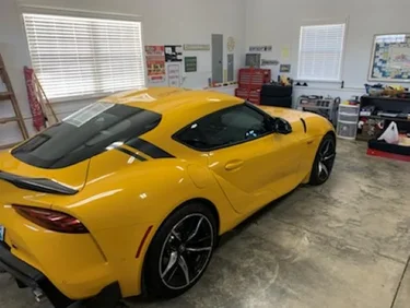
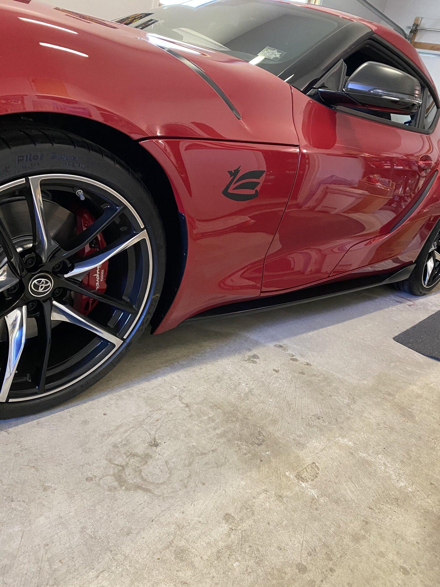
Looks great !Well, the badges arrived today and I've already put them on. I really like how they look. That's the great part about mods and customization in my opinion - we can all do what we like. They were pretty inexpensive and if I ever grow tired of it, they are easy to remove. Here's a few pics. We have snow outside right now so I couldn't get a good full side shot from in the garage. I like how they balance the A91 stripes I added in the back. I believe my cosmetic mods are now complete.


Lots of folks have ... #EmbraceTheM. And then add some retro logos on the front fender.Anyone put BMW badges on theirs yet?
Anyone old enough to remember when white-putting a car was a thing? Everything painted white. Corvette even had an “arctic” version. https://images.app.goo.gl/Zc34wbJXczV6rPX87Is "debadging" still a thing? I thought that died out over 10~15 years ago along with the "murdered" look where everything was "blacked out"...